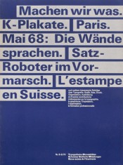
Emil Ruger
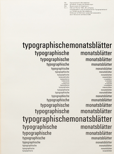
I love Univers so this came naturally to me. The way that he uses asymetry in his design is impeccable. It is interesting how the type looks so different from the top to bottom.
Andre Gurtler
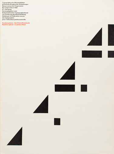
This composition is very interesting in the abstraction. Gurtler is a Swiss typographer that worked in the same company as Ruger.
Felix Berman
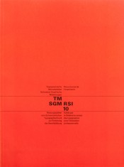
The use of white space is what makes this composition so strong. Berman worked in Isreal for a while. Also, this composition uses asymetry also.
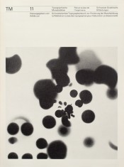
The image in this is interesting. It catches your eye, yet helps you see the type at the top.
I love the use of color. Also, the blocks around the letters help to add an image to the flat surface. The hierarchy is great in this composition too.
Hans Ferdinand Egli
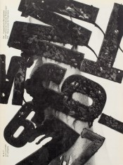
The texture and placement reminds me of expressive type. Egli worked in Oberwil.


